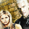
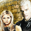
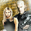
For my posting day for this round, I present two banners with wallpapers, Warm Chanpagne and Leather and Leather, under the cut. Totally worksafe. Here is a bunch of icons made from the two pieces. Feel free to snag any, be inspired to write stories or already have a story they’d suit. Happy to personalise if required.
I’ve written a bit about my process after the images, for anyone interested. My goal here was to create a tribute to the comics using screen caps. So a combination of paint, photorealistic and drawing.
 |
 |
 |
 |
 |
| 1 | 2 | 3 | 4 | 5 |
 |
 |
 |
 |
 |
| 6 | 7 | 8 | 9 | 10 |
.
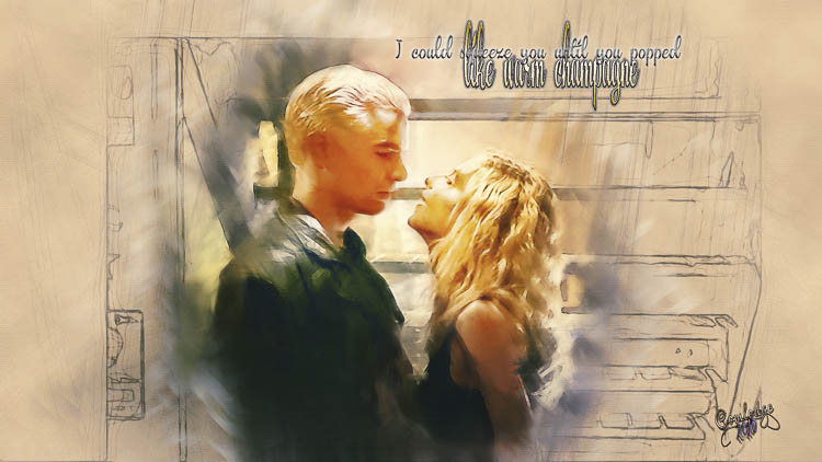
Click image for full size version
.
Leather and Leather
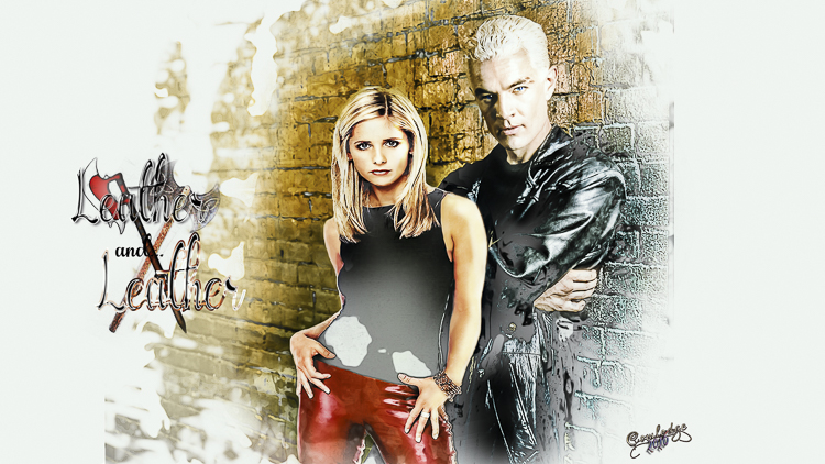
Click image for full size version
I am planning on posting these to my own journal eventually with a bit of a how to – But I’ll probably have forgotten by then, so for fellow artists and anyone interested in my process, here tis.
The bottom image is a composite. Both images were enlarged quite a bit, converted to smart objects and taken into Camera Raw. I love to play with the Clarity Slider, then the Dehazer, then come back and muck around with the white balance then try Auto on the main sliders on the front page and tinker with them until I get the lighting somewhere I like. I will play heaps more in Photoshop becasue Camera Raw can only do so much.
Then, because I’ve now got a totally noisy image, I go to the third page of sliders and really bump up the Luminance slider which reduces noise, tinker with the Detail slider and the colour sliders, then go up to the sharpen sliders and bump the sharpen up quite a bit, take radius up to around 2 and then take the mask most of the way to 100%. You end up with a rather painted effect. Take it back into Photoshop, use the sharpen tool to pick out features, generaly duplicate the image and use the high pass filter (I’m putting back some of the features that I’ve smoothed too much, use the smudge tool on rough edges and pixelated colours, add some Levels layers, a couple Curves, Colour Look up, add some highlights and general lighting by painting with white or near white colours in a blank layer set to Overlay and reduce opacity as required.
For the top image, I upped the shadow sliders in Camera Raw while I was there and when I brought it back into Photoshop I used Image/Adjustment/Highlights/Shadows. This is a great tool for taking out shadows and altering highlights. It is changing your image though so just rememebr that.
Then, I used a couple of Photoshop actions by Sevenstyles (buy them on Envato Marketplace – about $6 aussie dollars). The first image I used his Modern Art 2 and the second Modern Art. He has about a million different ones.Run the actions and then tinker with them. In both images I removed the effects from their faces and some of their clothes. Basically you start with a flattened image, paint in a mask in a new layer of where you want the action to work and press go! The actions creates the backgrounds for you. They are all modifiable which is like way cool!
Sevenstyles has provided a number of colour options in his actions but I generally ignore them and start tinkering with Curves, Levels, Color Balance and Colorfill layers and different layer blend modes on top of the actions. I almost always use a curves layer with the line bowed up for lightening and another with line bowed down for darkening. Invert the masks on both and use a white filled brush set to 15-20% fill to paint in either lights or darks to bring up your highlights and shadow. White painted into an empty layer set to overlay is a really quick way to put light into a piece. I had to tinker a while with Buffy in the second image because she was lit directly opposite to Spike. So often the way when sticking one or more images together.
How do I get shiny wet look leather? I sharpen mercilessly (keep a watch for artefacts/pixelation, though) and then use the curves trick above to add light to the the highlights and then increase the shadows a bit to add contrast. So Cool. Often a black to white gradient set to soft light will set your leather off beautifully. Luminosity masks are also totally brill for this, though I keep forgetting to use them.
Getting the couple to pop in the top image. I spent quite a bit of time sharpening, highlighting and smudging. Lighting is the real secret to popping part of your image. I used a couple of the white/near white paint in an empty layer set to Overlay/Softlight trick to help them stand out from the background. The plain brown, sketched background around their little circle of colour also helps this effect.
On both of them, the font is Beautiful Trouble – it’s gorgeous. I added a few layer style effects to get the colours and lighting I wanted. The scythe and battle axe are images I glummed from the internet and ran one of my actions on that basically turns them into charcoal sketches and then another that brings back some of the original colour.
I’m sure you all got the play on Leather and Lace. Lol.
Originally posted at http://seasonal-spuffy.livejournal.com/550901.html

